Menu
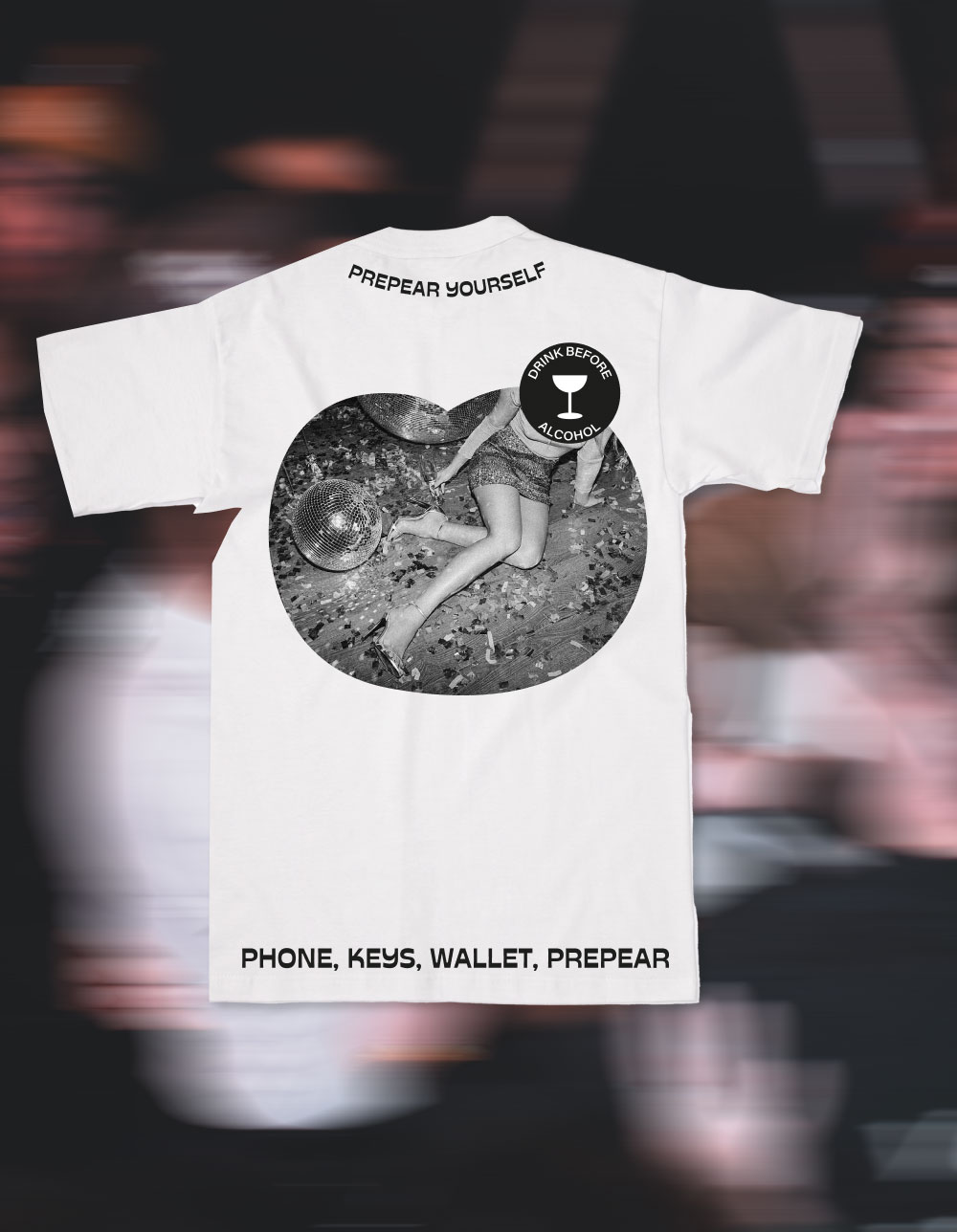
When PrePear came to us with a drink designed to help prevent hangovers, we saw an opportunity to sell something bigger than recovery. We weren't interested in reminding people about the morning after. We wanted to celebrate everything that comes before it.
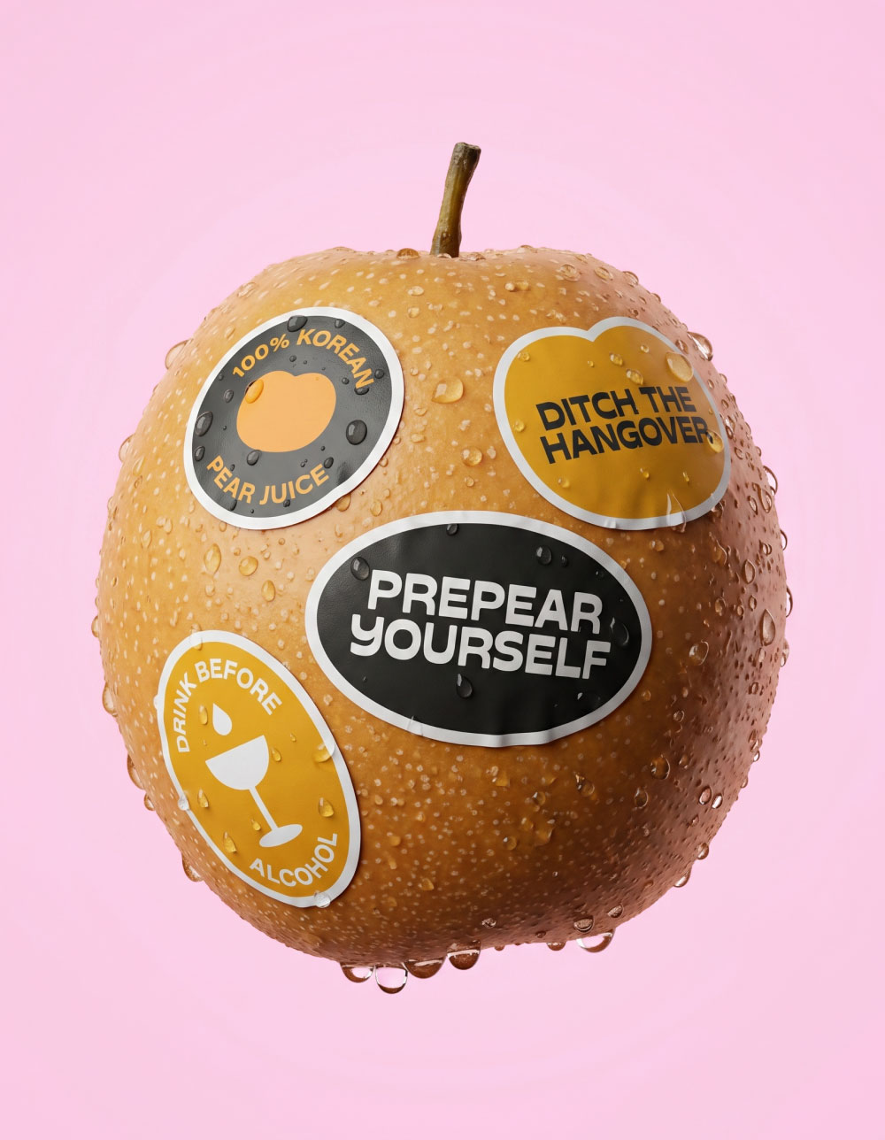
Functional wellness had become crowded with clinical claims, medicinal cues and forgettable branding. As one of the first Korean pear juice brands entering the UK market, PrePear needed more than standout packaging. It needed a place in culture. It needed that metaphorical cheeky wink.
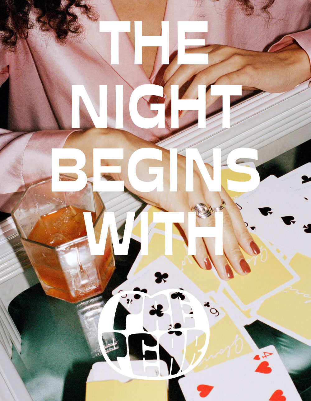
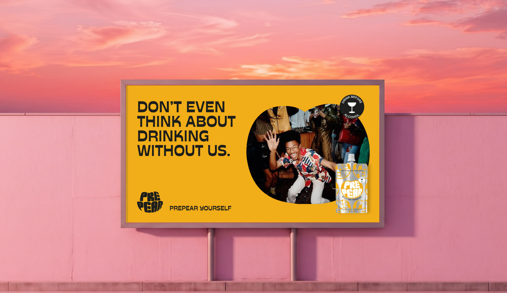
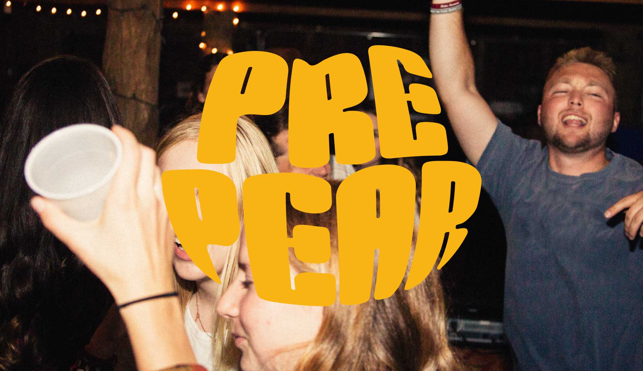
Our audience and category research revealed that people weren't looking to drink less. They wanted to squeeze the (pear) juice out of life. Dinners that turned into late nights, spontaneous plans and saying yes without worrying about tomorrow. That insight became Full Life, a brand platform built around balance, enjoyment and optimism instead of restriction and recovery.
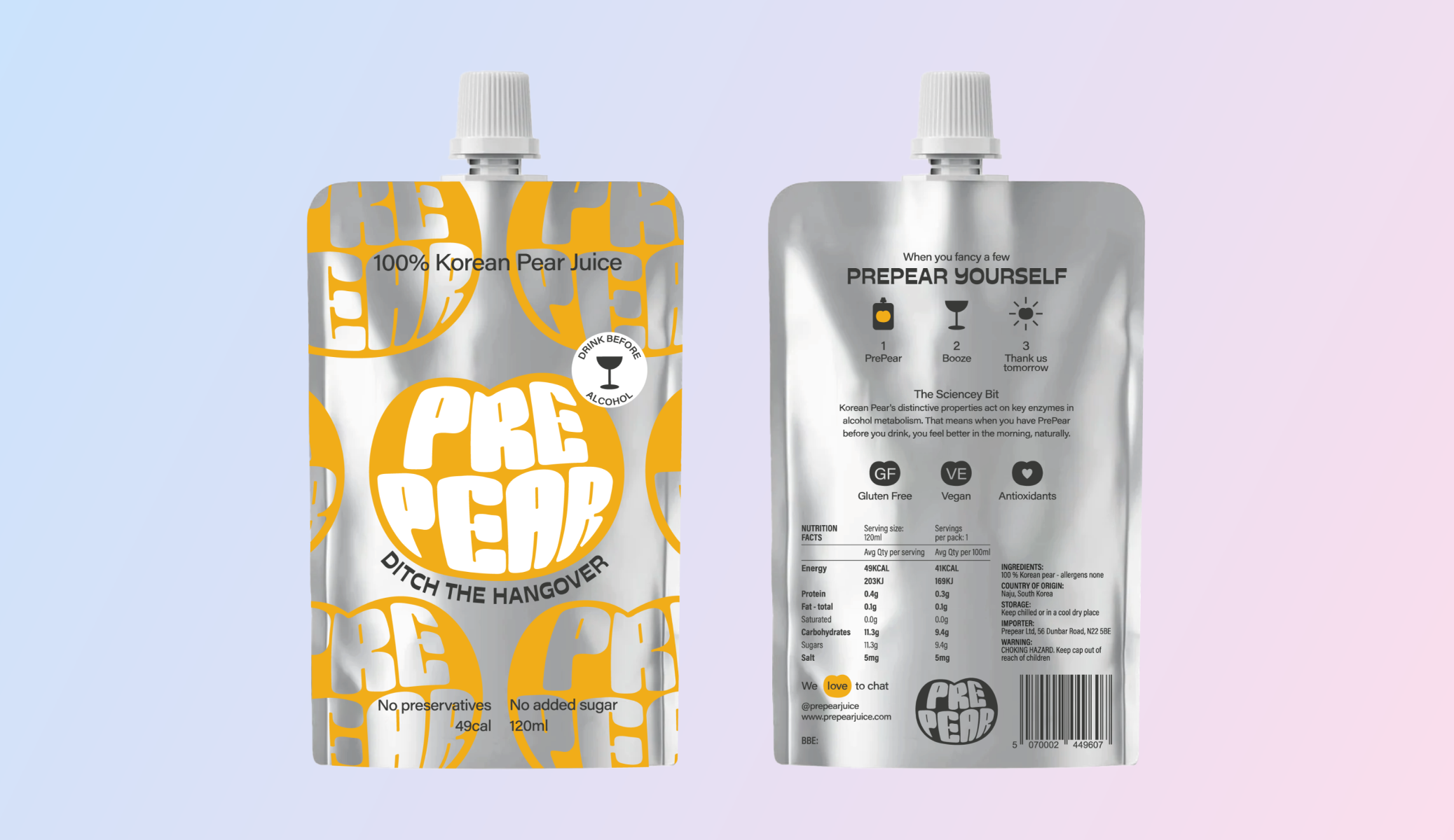
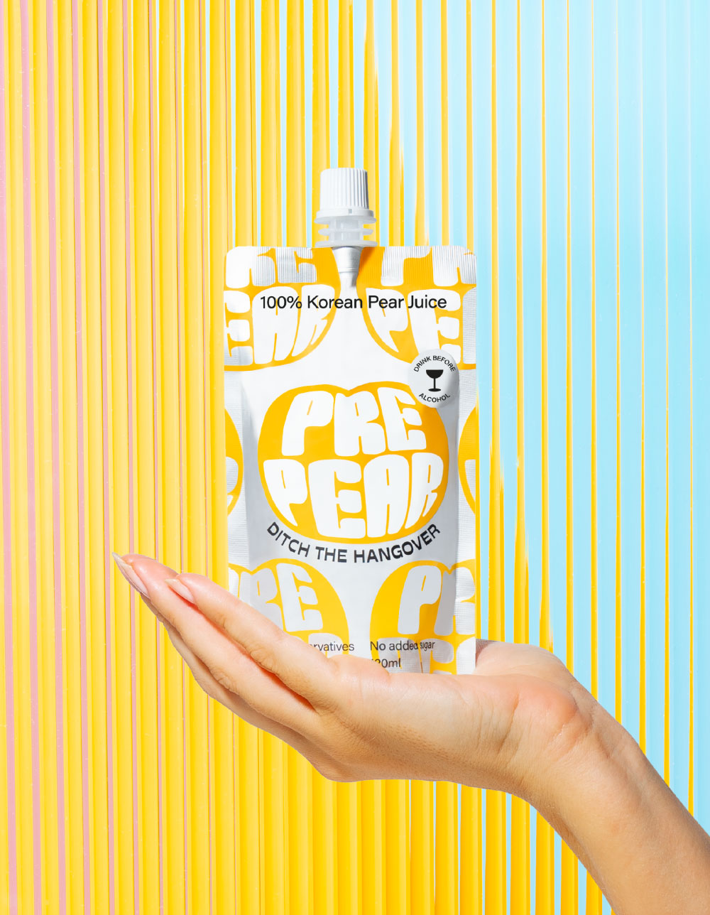
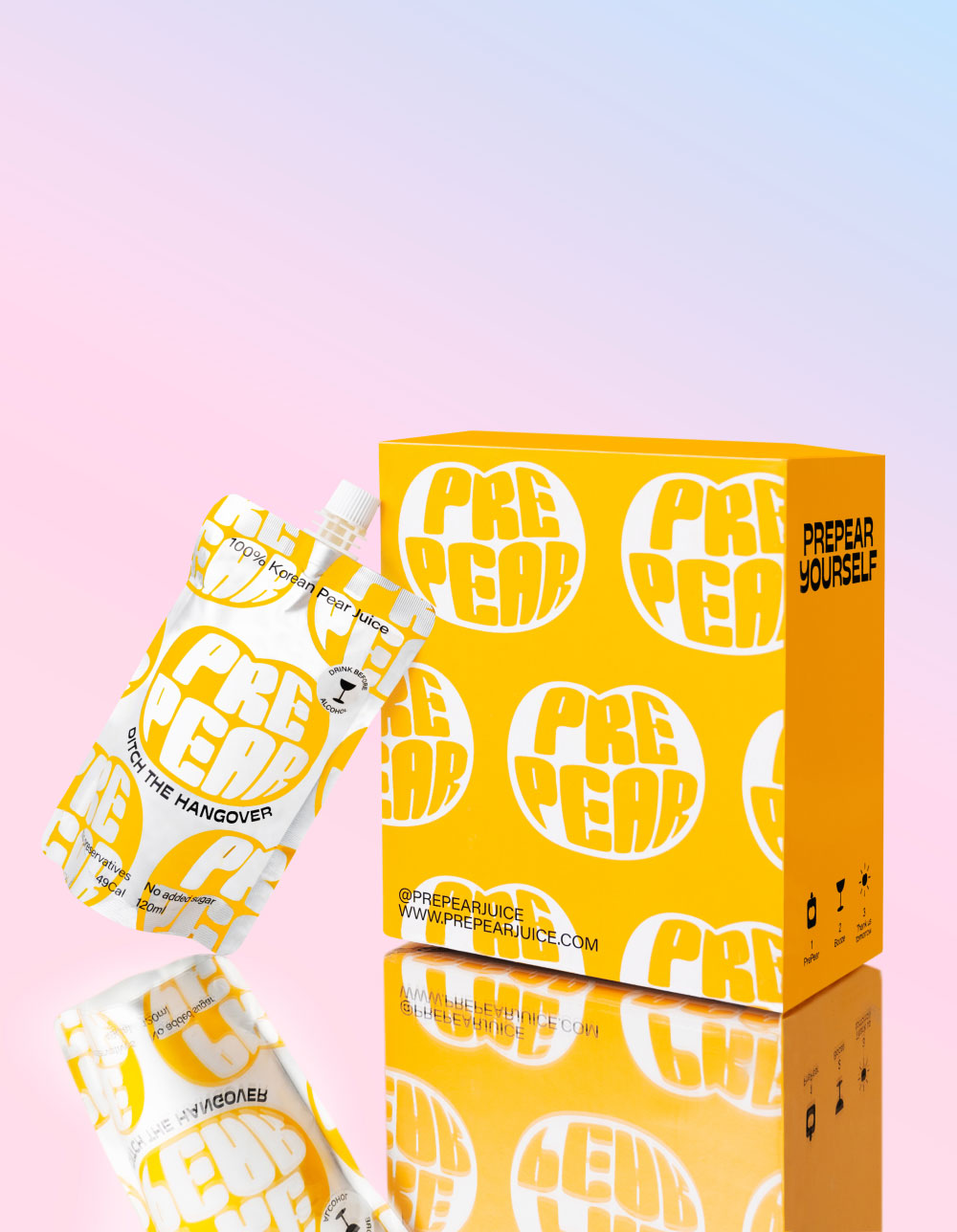
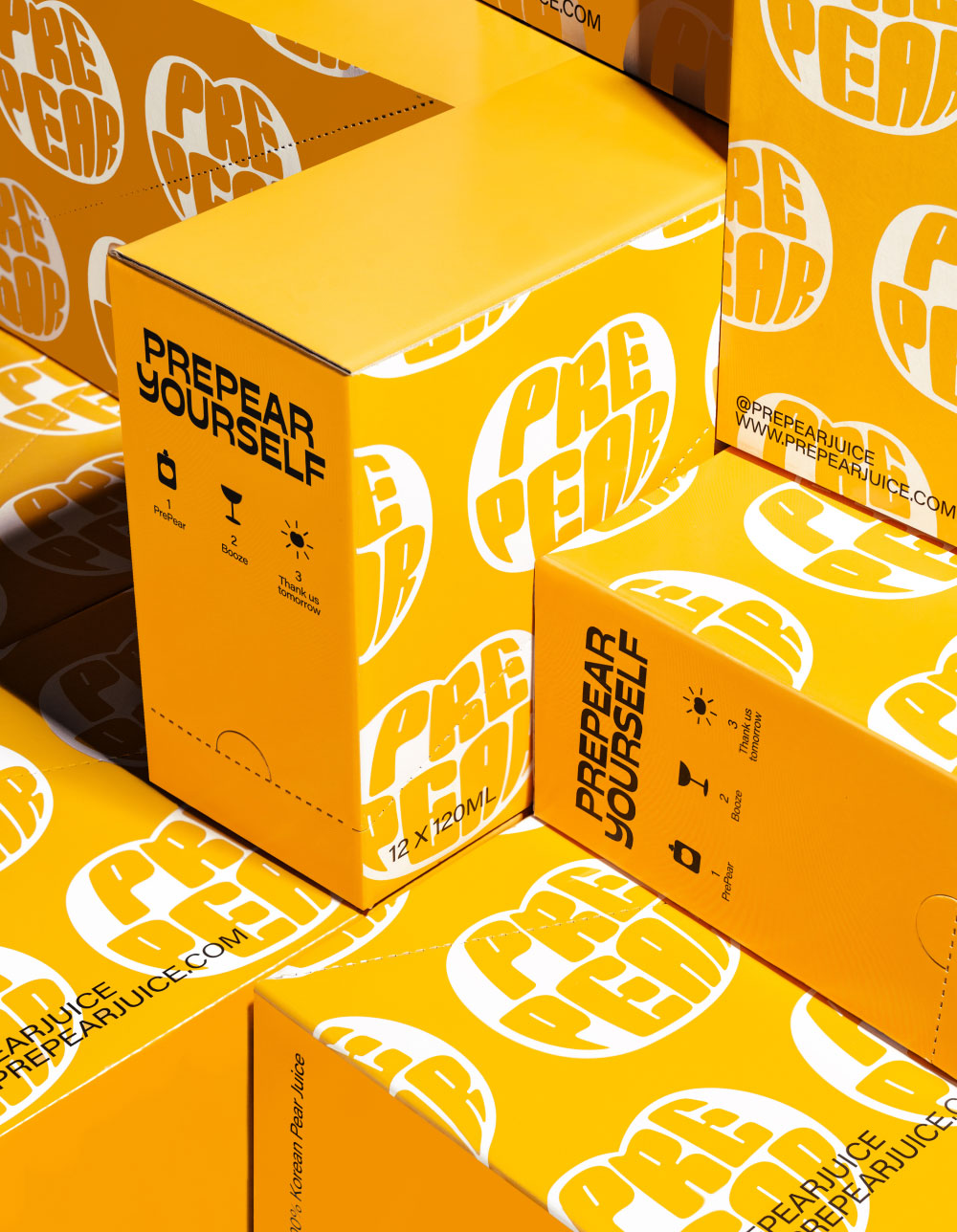
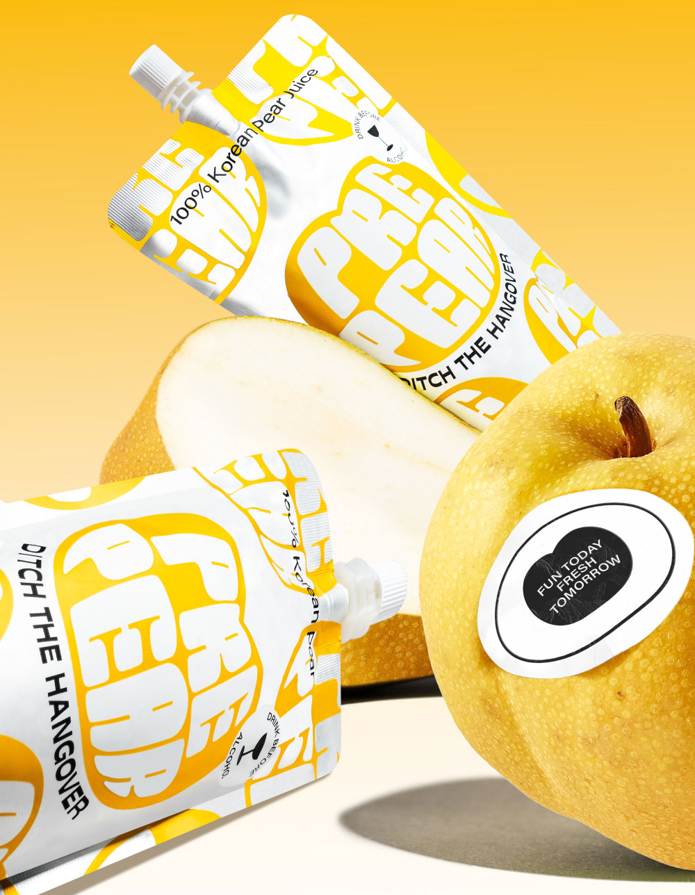
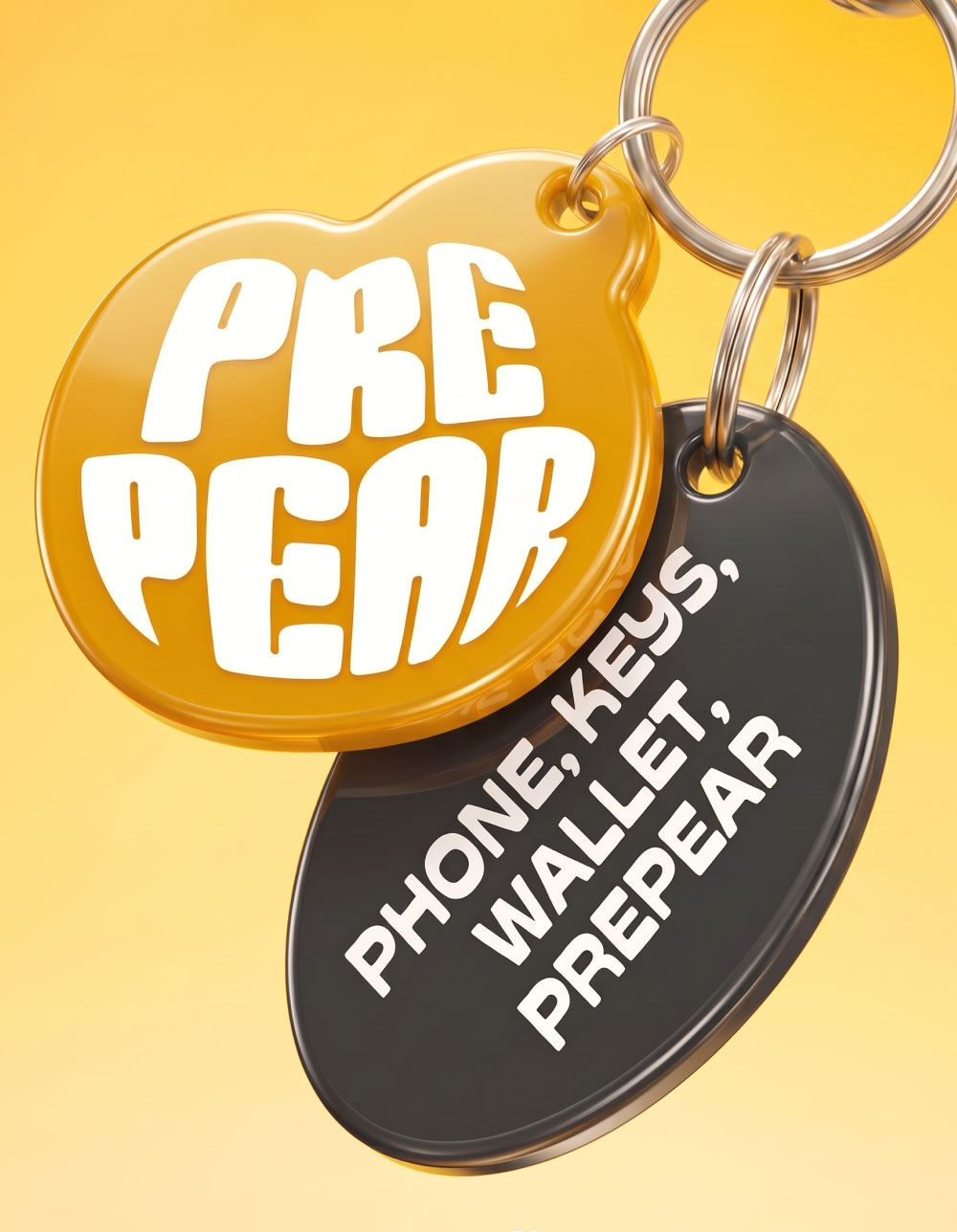
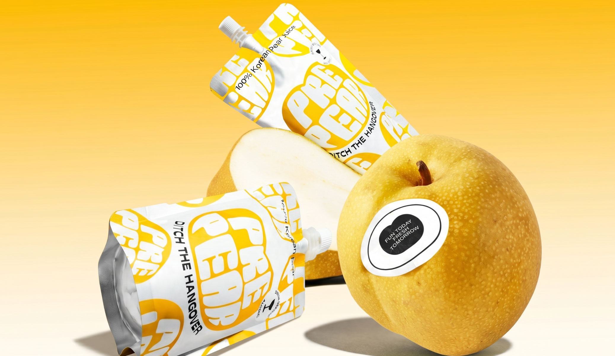
The packaging became the brand's biggest differentiator. In a sea of supplements and science led design, we created something people would actually want to pick up. Inspired by the shape of the Korean pear, an oversized wordmark became the hero of the pack. Repeated across the pouch, it evolved into a distinctive graphic language that gave PrePear the confidence and appeal of a modern lifestyle brand rather than a functional wellness product.
The result is a brand that makes an unfamiliar product feel familiar, desirable and impossible to miss. One that feels just as much a part of the night out as the morning after.